Everyone loves a good gallery wall, but they can be intimidating if you’ve never put one together before. There’s a lot to consider: the layout, what frames to use, what to put in the frames, how to hang them, etc. Even though the gallery wall trend has been around for quite some time, I’d been scared to try one myself until recently. I’m so glad I finally did, and in doing so I came up with some tips for how to create a gallery wall. This post contains affiliate links.
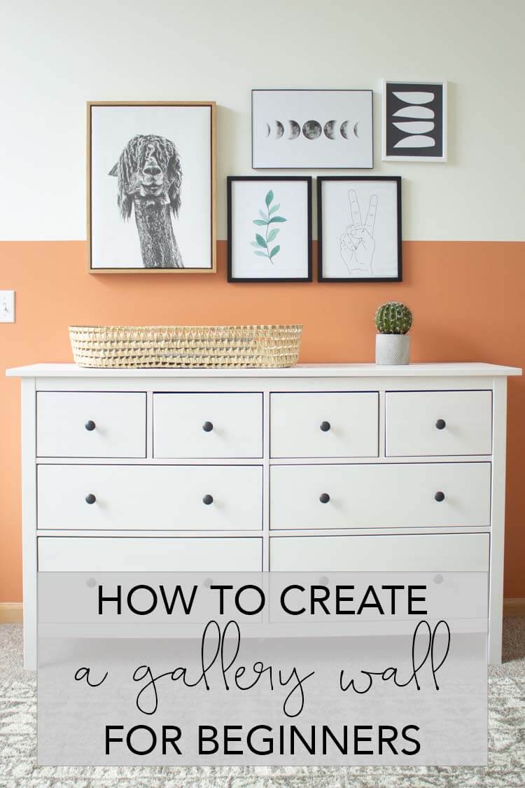
I know I likely don’t need to convince you why you should also attempt a gallery wall. They look great! They add visual interest to a space and they don’t clutter up your floors.
Honestly, I’m not great about hanging things on the walls. I don’t really feel a connection to a lot of art and I had hung up far too many cheesy things in the past. It felt easier to go with my minimalism tendencies and forgo hanging things on the walls altogether.
But with some practice and by following some basic guidelines, I’m finally more confident in my ability to decorate my walls. And even to put together gallery walls now!
How to Create a Gallery Wall for Beginners
These tips for creating a gallery wall for beginners are most helpful if you plan to create an asymmetrical gallery wall with different pieces of art or wall decor. I’ll break down exactly how I put together this gallery wall in steps you can follow. I put these tips in the order it makes sense to me, but honestly they’re pretty interchangeable until you get to the end. It doesn’t matter if you choose your art or your layout first, as long as you end up with the right sizes of everything you need. If you’re creating a completely symmetrical gallery wall, the part you’ll want to pay attention to is step 5 to make sure everything is even!
- Find one piece you love and base the rest of your gallery wall design around it.
- Create frames out of paper (wrapping paper works great for this) cut to the desired dimensions and tape them to the wall until you find a layout you like.
- Incorporate both symmetrical and asymmetrical features.
- Decide what to fill your remaining frames with.
- Use picture hanging tools to make sure everything is spaced evenly and straight.
Find one piece you love and base the rest of your gallery wall around it.
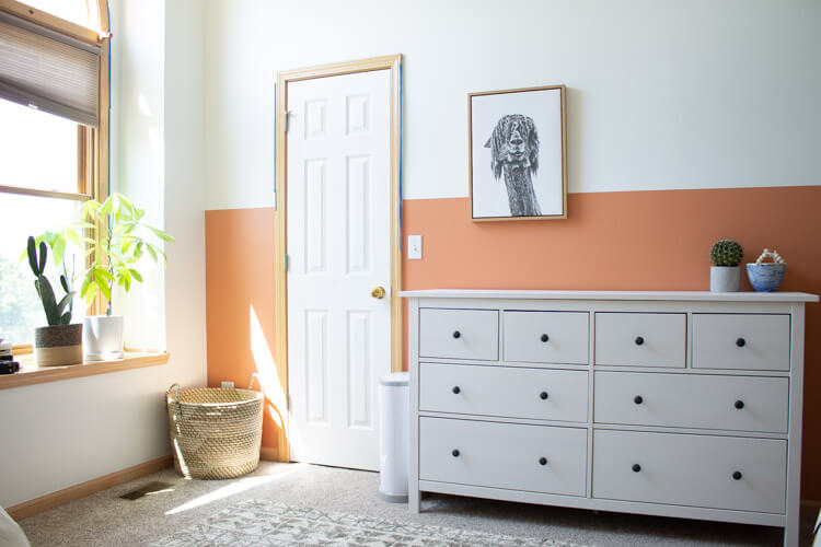
I knew I wanted a gallery wall in the guest room turned nursery I recently decorated, but I wasn’t sure what to include in it until I found this awesome llama wall decor (similar here). I knew it was large enough to fit the space and whimsy enough for a baby room. I wanted something quirky and fun, but also modern, and this guy fit the bill.
I do think it’s important for your one piece to be large. You can hang it either to the left or right side of your wall and the rest of the planning gets easier, especially if you’re going for an asymmetrical gallery wall. Also, larger wall decor tends to look better in a room. Smaller pieces end up looking cluttery and it’s harder to get the spacing and layout to look aesthetically pleasing.
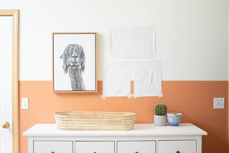
Decide on a layout by taping paper frames to the wall.
This part felt the most intimidating to me. Deciding on frame sizes and where to put them seemed like an insurmountable task. In reality, it didn’t take near as long as I imagined. I measured the length of my existing wall art and added a couple inches to figure out the area I needed my remaining art to cover. I figured I’d like some pieces to sit above and below my llama.
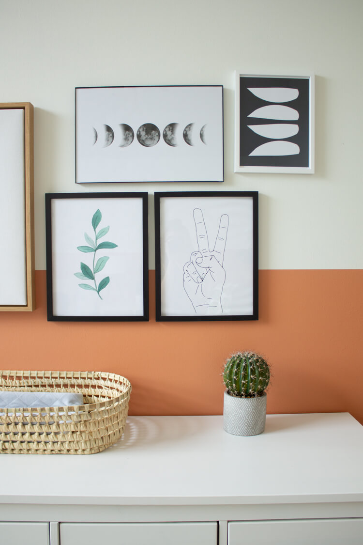
I also decided to go with fewer, larger frames. The ceilings in this room are actually quite high, and I didn’t want them to dwarf the gallery wall. So the smallest frame I used was an 8×10. I measured out a few common frame sizes, and taped those to the wall. In this layout, I like how the 3 middle frames are somewhat symmetrical, but the two outer pieces are not.
Incorporate both symmetrical and asymmetrical features.
Incorporating both even and uneven features will help your gallery wall stay interesting without looking too hodge podgy. Another thing to consider is opposites. While the llama art is centered height wise for the gallery wall, the small piece on the opposite side is hung higher. The llama is in the largest frame, and the art on the opposite side is the smallest. This gives a balance to the gallery wall as a whole.
Decide what to fill your remaining frames with.
This is the part where there are rules, but basically the rule is there are no rules. Coordinating what to put in your frames, which frames to fill with which art, and type of frame to buy can be overwhelming. Here are a few ideas to help you get started:
- Choose 1 type of frame and 1 type of art. Ex: Black frames with only black and white art or photos.
- Choose different types of frames and 1 type of art. Ex: Black and gold frames with only black and white art or photos.
- Choose 1 type of frame with different types of art. Ex: Black frames with both black and white and color photos or art.
The key is to keep some part of your gallery wall consistent. You might look at mine and think it looks pretty random for someone preaching about consistency. I have 3 colors of frames, black and white art and colored art, photo type art, abstract art and animated art. That’s a lot going on!
For me, the consistency was white space. Each piece has a lot of white space in it. I couldn’t find another light wood frame like the llama frame, so I decided to use the white frame and fill it with a piece of art with color. Also, my color palette is neutral here. Mostly black and white, but with one pop of natural green and one pop of navy. (You may not be able to tell the but the far right piece of art is actually navy.) I wanted art that was more realistic than cartoony and had an overall modern feel.
Create a mood board to help you choose art
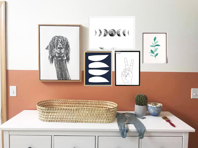
If you are using random pieces of art instead of photos, you want to be sure the overall vibe is the same. One thing that really helps me decide on art is to create a mood board so I can see it all together before purchasing. I typically order my art online. I found all these pieces on Etsy. So I just screenshot the image, crop it down and paste it in a word doc. You can also use picmonkey or photoshop to achieve the same thing.
I actually made this one in photoshop before mapping out my frames on my wall. I just took a picture of the space and then added the images of the art I liked.
Choosing frames
Whether you choose the art first or your frames first, it is helpful to have your layout decided before purchasing frames. Then you don’t have to run all over the world looking for the right ones, then returning them when they don’t fit. Learn from my mistakes people!
And guys, frames can be expensive! I suggest going to a place like Michaels or Hobby Lobby where you know they have nearly every size of frame imaginable during one of their 50% off sales. Also check the back of the frames to be sure they have a way to hang them on the wall. I actually bought some I thought were a super great deal, got home and realized they had no hooks on the back. I had to go back out once again and buy some velcro command strips. But if you do end up in that situation, they actually work really well!
Use picture hanging tools to make sure everything is spaced evenly and straight.
Let me be honest here, I do not measure everything out exactly. Aint nobody got time for that. But I do have two magic tools that help me get it pretty close in no time at all.
These two tools will change your life when it comes to hanging things on the wall.
The Markit picture hanging tool allows you to hold up your frame where you want to hang it and make sure it’s level, then you can push a tiny indent into the wall where your nails need to go. It’s amazing.
The auto leveling laser throws a beam across your entire wall so you can make sure everything is perfectly level. Great for if you have more than 2 frames or if they’re too big for the Markit tool. Also it was the only tool I used to get a straight line for my color block wall. The stud finder is super helpful when you’re hanging heavier things on the wall.
So use these two tools to get everything hung up according to your layout, and you’re finally finished! Hopefully your nail holes ended exactly where you intended, but if not, nail filler is an easy fix. You can do it!
Enjoy your awesome gallery wall
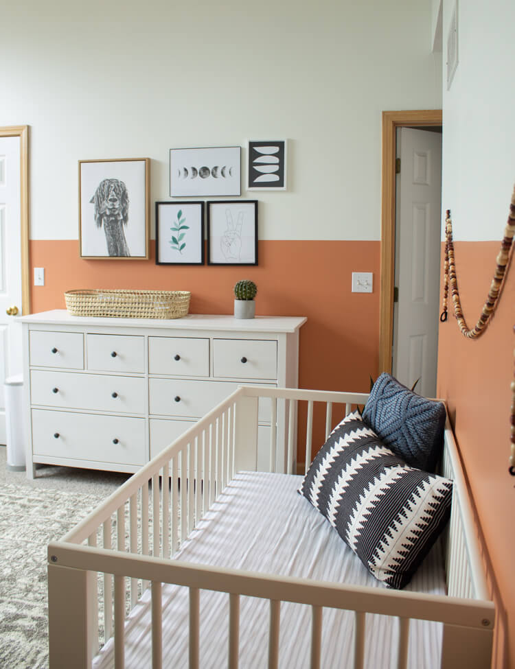
Now that you know how to create a gallery wall, you’re on your way to putting together a Pinterest worth room that makes you proud each time you’re in it!

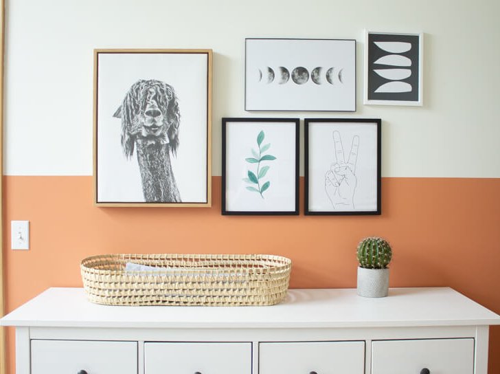

How to Fill a Large Wall Space with Art and Decor? Interior Design Tips
Sunday 13th of October 2024
[…] https://www.mybreezyroom.com/gallery-wall-for-beginners/ […]
Sarah
Tuesday 11th of December 2018
I've been wanting to create a gallery wall for so long, but am scared I wouldn't like it, or it wouldn't turn out right. Yours looks so lovely, and good tip on using paper and tape first.
Sarah | https://www.dreamofhome.co.uk
Miss M
Thursday 28th of August 2014
Ooooo this post was perfectly timed! I was thinking I'd make a gallery wall this weekend! Thanks for the tips... 3 - 5 things feels way more manageable than a ton!
Kala
Sunday 31st of August 2014
Glad this helped. I hope your wall turns out great!
Amanda McCellon
Monday 18th of August 2014
I love your office space. Our new home had a built in desk area off the kitchen that I've been working on setting up for my work area. I don't have room there for a gallery wall, but I love all the elements you used in your space! Thanks for the inspiration!
Kala
Saturday 23rd of August 2014
Thank you! I think I would love a built in area, especially if it has shelving! That's the one challenge I haven't addressed yet.