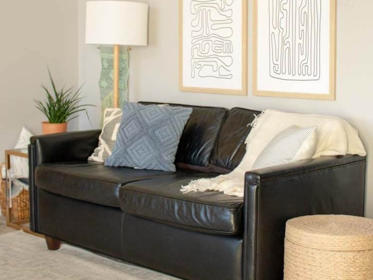
I am so excited to share this living room refresh with you today! This little area is the first thing you see when you come in our front door, and while I really liked the double shelf look we’ve had for the past couple years, it’s definitely run it’s course. I’ve been bored with restyling the shelves the last couple seasons and I was feeling something a little less cluttered and a little more functional.
This post is sponsored by Joss and Main, but the content and opinions expressed here are my own.

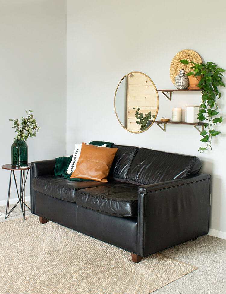
So functionality wise, this space was lacking just about everything. It was definitely time to do something about that since this is one of my favorite spots to sit and work. But there was no lighting, no permanent side table, and no ottoman. So I knew those were the very first things I wanted to fix.
When I redesign a room, I find it really helpful to pull in everything I’m considering to a photoshop document. I just screenshot the items and then bring them in one by one to see how they play with one another. The eraser tool is helpful for erasing backgrounds of some of the images so they look more realistic together. I knew I wanted a mix of different neutral textures, so I had fun playing around with a bunch of different stuff before landing on this final look.
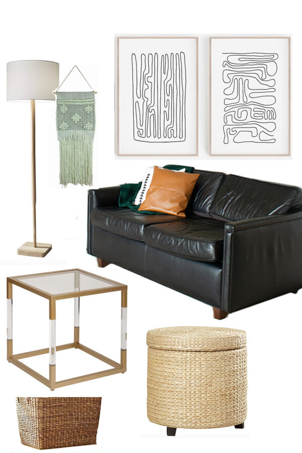
I always get a little nervous bringing one of these designs to life. Like what if the colors aren’t how they appear online? Or it just doesn’t come together how I imagine?
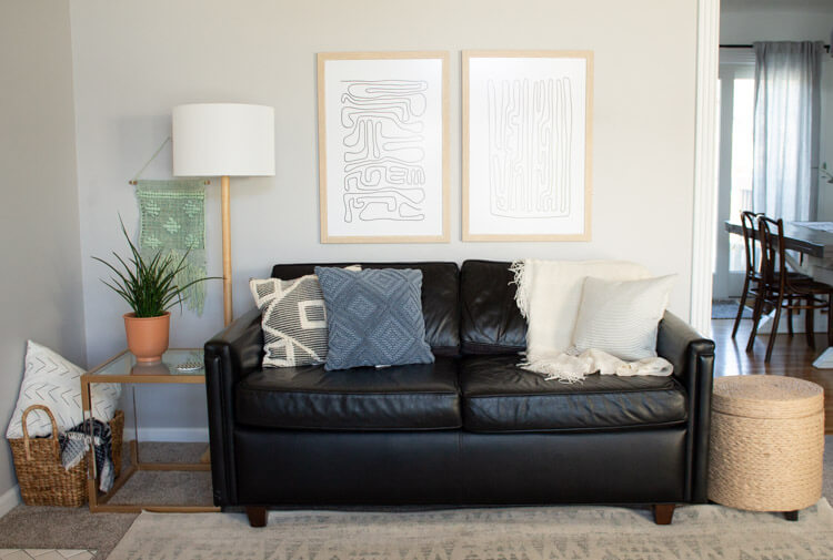
Luckily, this one turned out so good I think! I do wish I had white walls in this room, but I can’t make myself commit to that project with the high ceilings in this room. Either way, it feels so different. Lighter but more grounded in the best ways! So let’s talk about how I decided which pieces to use.
I’ve had this fun but neutral artwork from Etsy picked out for a while now. So I knew I’d be using that and our black couch to create a new look. The art is 20×30 and you can read about that framing process here.
From there, I started with the side table and side tables are hard, people. There are just so many options. I finally decided to go with this gold and acrylic one. Honestly it felt a little out of my comfort zone, but I think it’s good to take a few risks with our homes. If you can call this a risk, ha! It’s still perfectly neutral and would fit in anywhere in my home, so probably the safest risk in history.
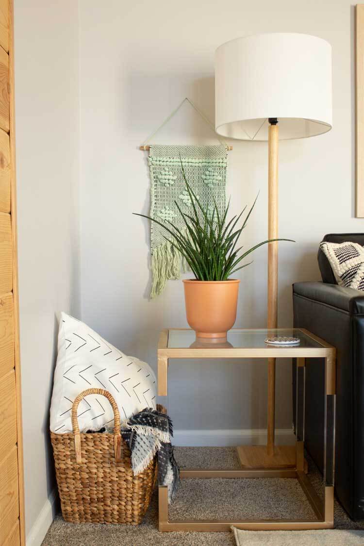
The second hardest thing was deciding on a lamp. SO. MANY. CHOICES. Originally I wasn’t sure about a floor lamp AND a side table, but this natural wood floor lamp is so so good I couldn’t pass it up. I’ve had this thing lately about overhead lighting searing my eyeballs off after dark, and it’s so nice to turn on this lamp instead.
And also, it just makes the room feel better. More complete. That corner had really been lacking anything with height or texture and this lamp just fills it in the best way. Honestly, I don’t have near enough lamps around my home, but they change the whole feel of a space. I need to make an effort to get more!
I’m totally loving that wall hanging too! Honestly I wasn’t sure if it was going to work. I originally envisioned it closer to the artwork but I kind of like how it creates a new little setup with the lamp and table.
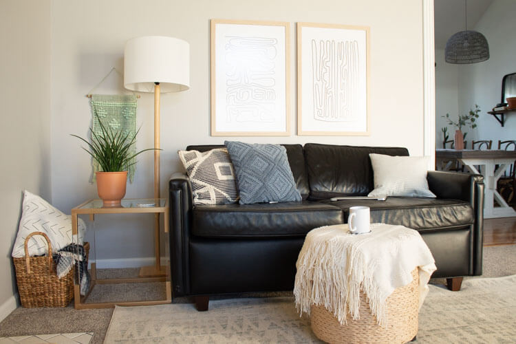
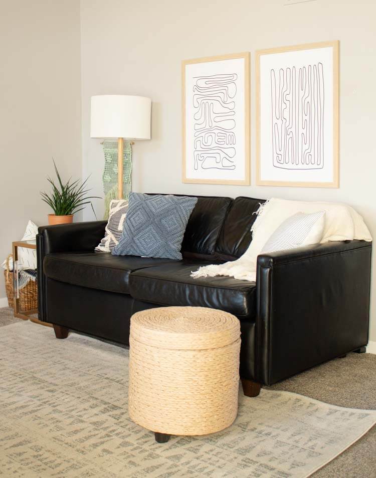
The big texture in this room is the basket and the ottoman. I am in love with the light color of that ottoman! We haven’t quite decided what we’ll store in it, if anything, but it also makes another great spot to set a drink or snack. Sometimes Graham likes to hide the baby toys in it, ha! I also added this white blanket and this geometric throw and pulled in a few cozy pillows from around our house.
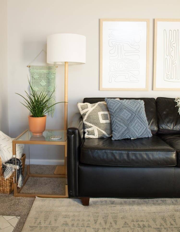
If there’s an area of your home that isn’t working for you, I encourage you to start playing around with the idea of a little refresh. I’m so glad we gave this area a little extra attention. And I’m so looking forward to spending more time here.
If you are considering a refresh, here are my top tips:
- Make sure you have the appropriate lighting,
- Make sure wall art is big enough for the space. (These prints are 20×30 each.)
- Mix a few different textures to keep things cozy.
- And of course every space needs a plant!

